
ROUGE
Brand Identity
Brand Strategy
A visual identity inspired by elegance, independence, and the ocean.
ROUGE is a swimwear label created by Marie Viarouge, shaped by French roots and Miami’s bold rhythm. Each piece reflects a woman’s strength, softness, and self-expression.
We partnered with Marie to translate that spirit into a full brand identity system. From logo and typography to color palette and voice, every element was designed to feel luxurious yet approachable, modern yet timeless.
The result is a brand that doesn’t follow trends. It sets its tone. Confident. Poetic. Made for women who move through the world with purpose.
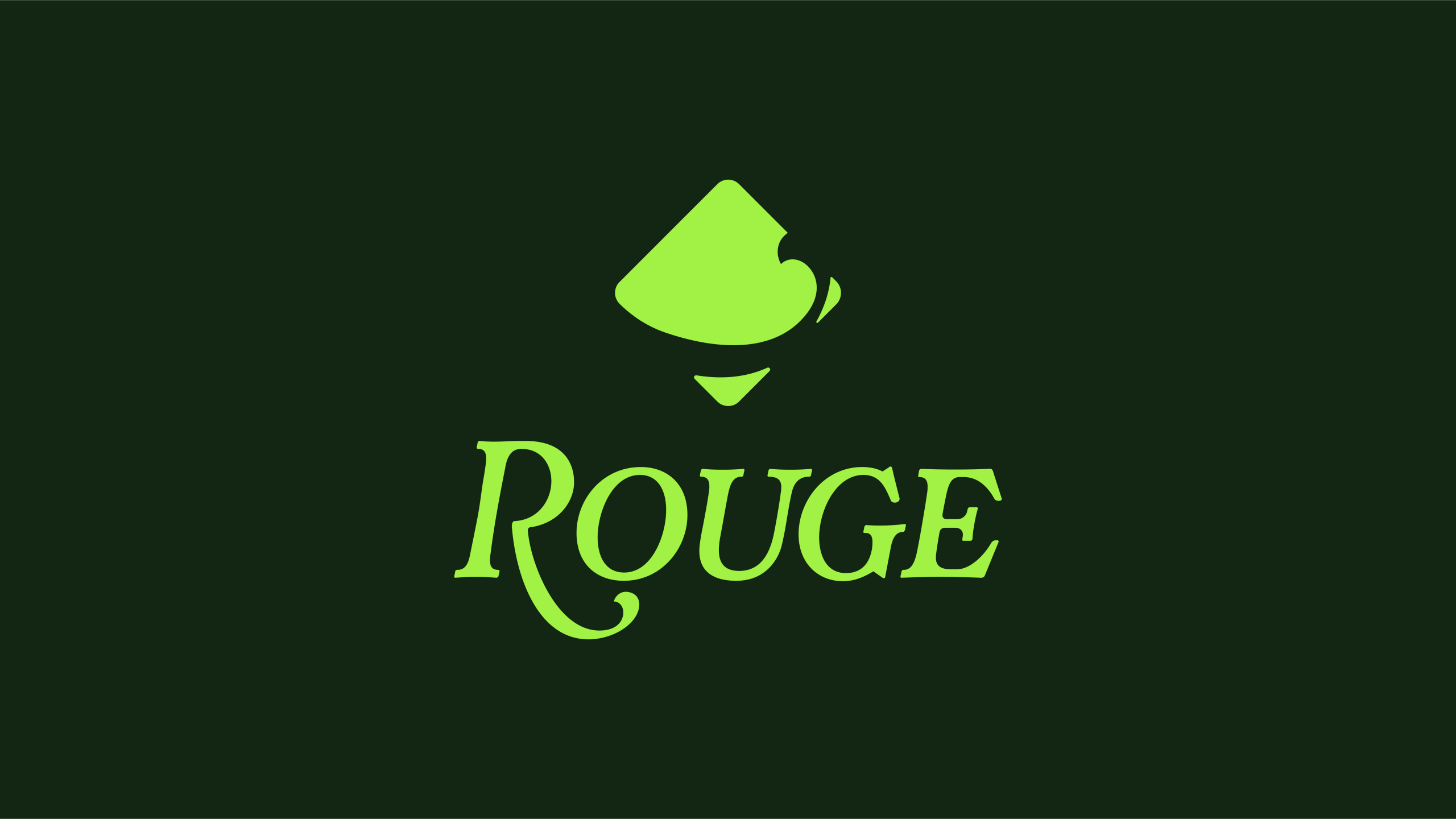
Logo Design
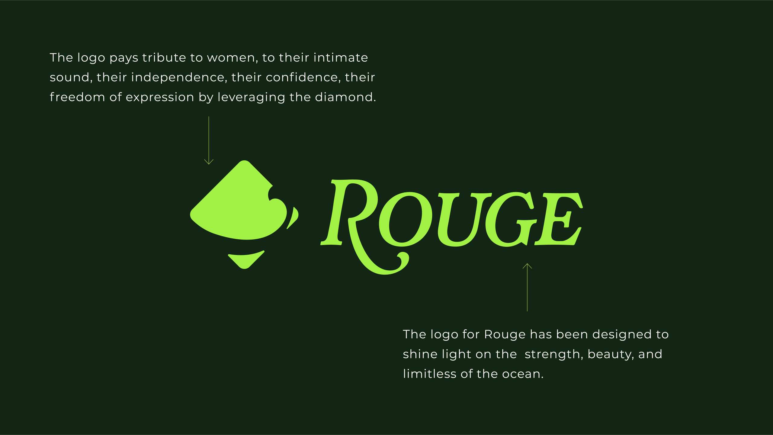
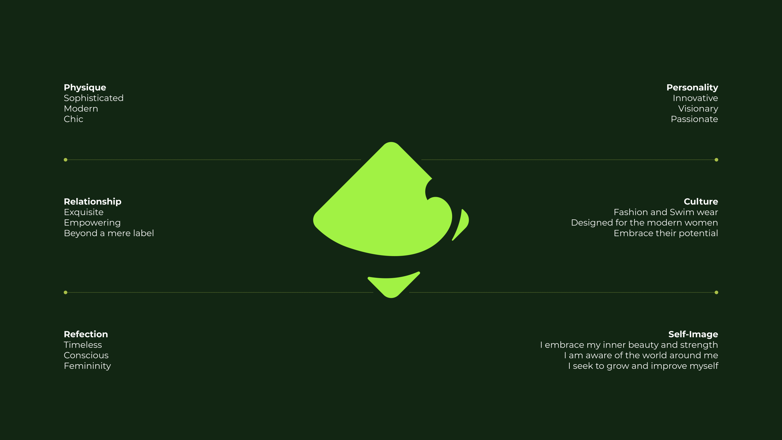
Where most fashion brands lean into minimalism for the sake of trend, ROUGE leans into meaning. The symbol is inspired by the ocean and the feminine form, shaped like a diamond to represent resilience, depth, and clarity. Every curve and point speaks to freedom, individuality, and power.
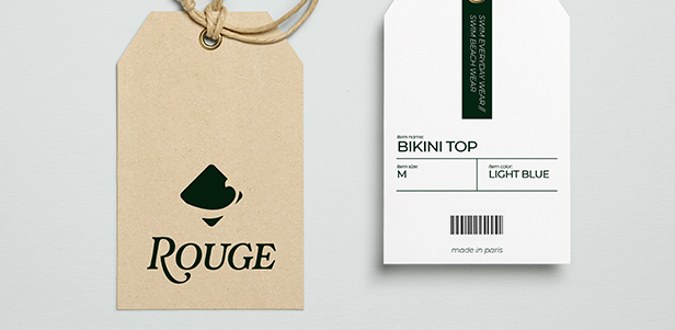
We paired this symbol with a refined, modern wordmark that feels timeless on a swimsuit tag and striking across campaign visuals. The lockup is flexible and intentional, designed to hold its own on everything from packaging to editorial spreads.


Photography
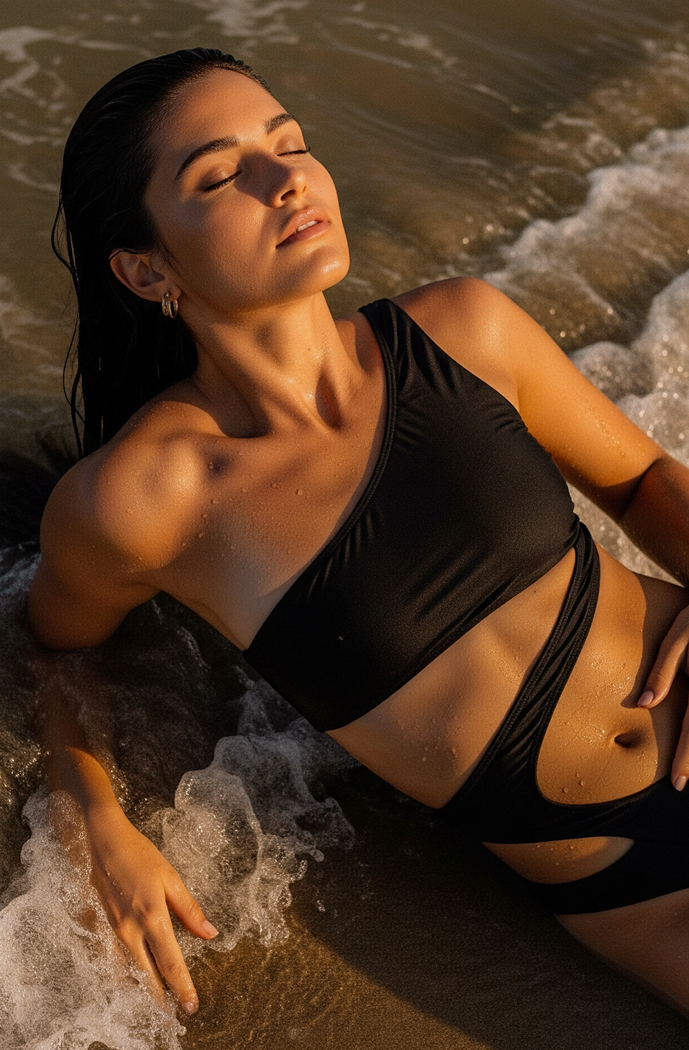
ROUGE’s photography captures more than the product. It captures a feeling. Each image is a fleeting moment pulled from a personal journal, soft and cinematic, suspended between intimacy and imagination.
The visual approach is rooted in natural light, warm shadows, and quiet beauty. Subjects are often caught mid-thought or mid-movement, never overly posed, never polished. These are the in-between moments. The glances, pauses, and reflections that feel like memories.
Set against lush landscapes, coastlines, and golden hour glow, the imagery blurs the line between fashion and film stills. Every frame invites you to look a little longer. To wonder who she is, where she’s going, and what story she’s writing for herself.




Color Theory
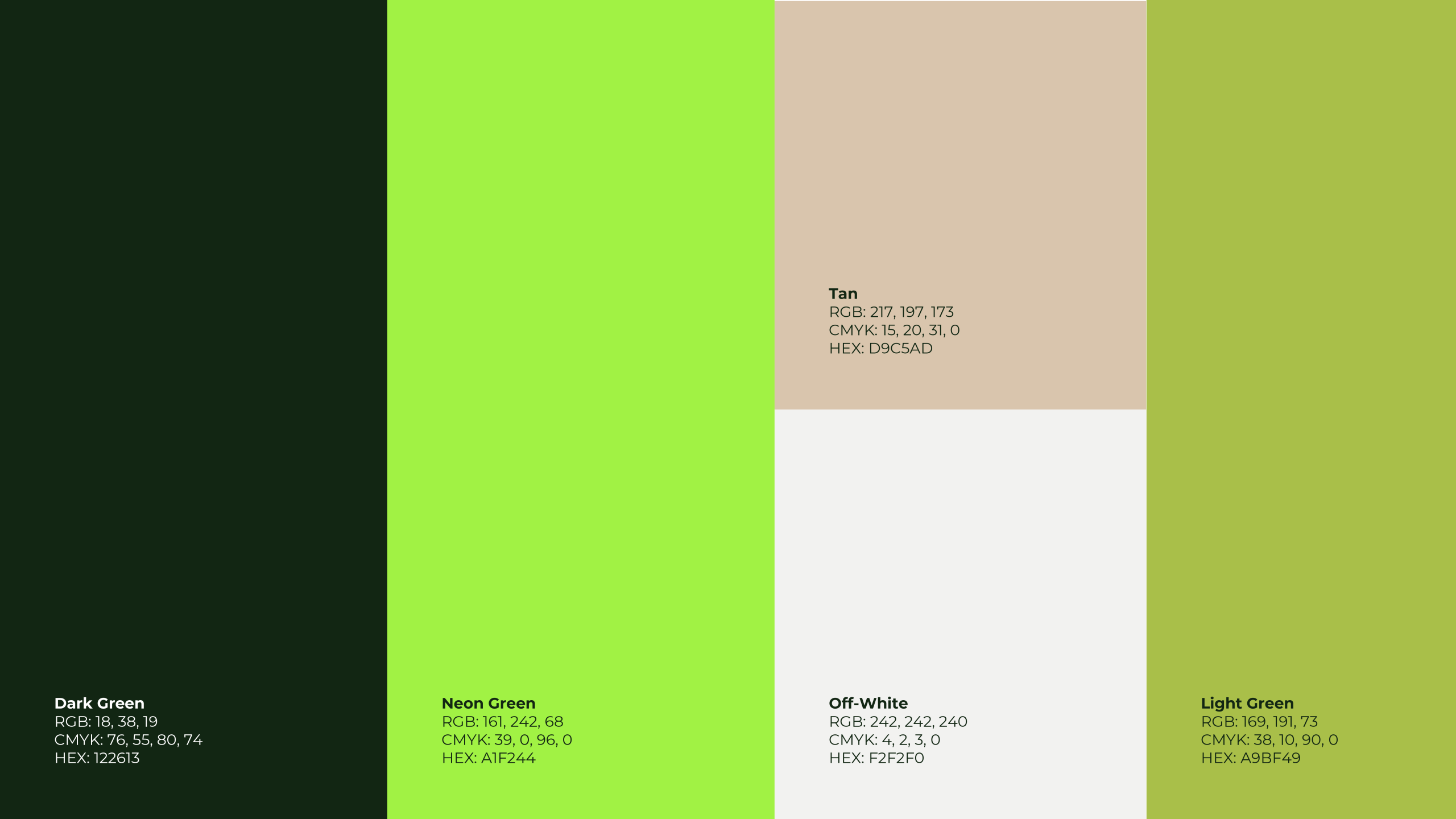
ROUGE’s palette is a reflection of contrast, confidence, and quiet depth. Each color was chosen with intention, designed to evoke emotion and support the brand’s duality of elegance and edge.
Dark Green anchors the identity. It speaks to strength, resilience, and timeless sophistication. It feels grounded, calm, and powerful without shouting.
Neon Green injects boldness and energy. It breaks through the softness with a modern spark, reminding us that femininity can be both vibrant and unapologetic.
Light Green offers balance. It evokes growth, optimism, and nature in motion. Positioned between softness and vitality, it bridges the palette with calm clarity.
Tan adds warmth and subtle sensuality. It feels human, earthy, and refined, grounding the bolder tones with a sense of ease.
Off-White serves as the breath between it all. Clean and understated, it gives the identity space to speak without distraction.
Together, this palette celebrates contrast. It honors both softness and strength, heritage and modernity.
Visual Identity
ROUGE’s identity is rooted in elegance, self-expression, and quiet strength. We chose Montserrat as the core typeface for its modern geometry and refined clarity. It is graceful without being fragile, confident without overpowering, and perfectly suited for a brand that celebrates the complexity and beauty of femininity.
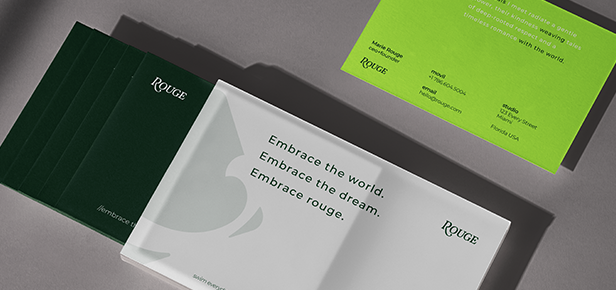
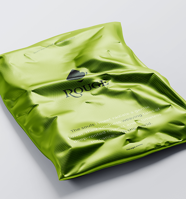
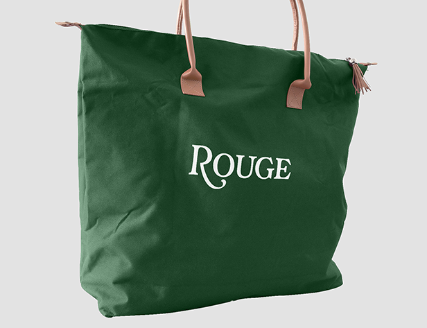
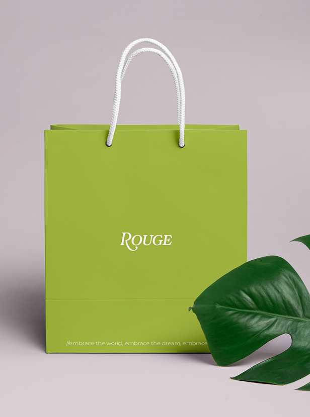
The brand system extends far beyond typography. From vibrant green shipping bags to custom tags and soft-touch packaging, every element was designed to feel like an intimate, elevated experience. The color palette brings depth and emotion, blending deep forest tones with soft, luminous greens that reflect growth, nature, and timeless beauty.
Layouts feel intentional and uncluttered. Space is used with care, allowing the product and language to breathe. Printed collateral and digital assets mirror the same energy. Bold but not loud. Minimal but never cold.
Across every touchpoint, Rouge feels like a story unfolding. From the swipe of a feed to the moment a customer opens a package, the identity invites connection and reflection. This is not branding for the sake of polish. This is branding as poetry.


Contact Us
Working Around The Globe
Phone: +01 305 910 1170
Email: IntertwineCreative@gmail.com
Copyright © 2025 Intertwine Creative
All rights reserved.