RawFit
Brand Identity
Brand Strategy
Apparel Design
Where grit meets design.
Born in Miami. Built to move.
RawFit isn’t just a fitness brand. It’s a mindset.
We partnered with founder Chris Rodriguez and his crew of athletes, artists, and visionaries to craft a brand identity that hits as hard as their mission. The goal? Build something that doesn’t just look athletic, but feels like ambition in motion.
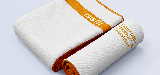
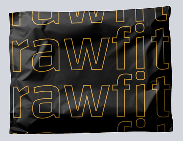
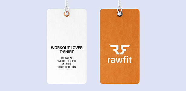
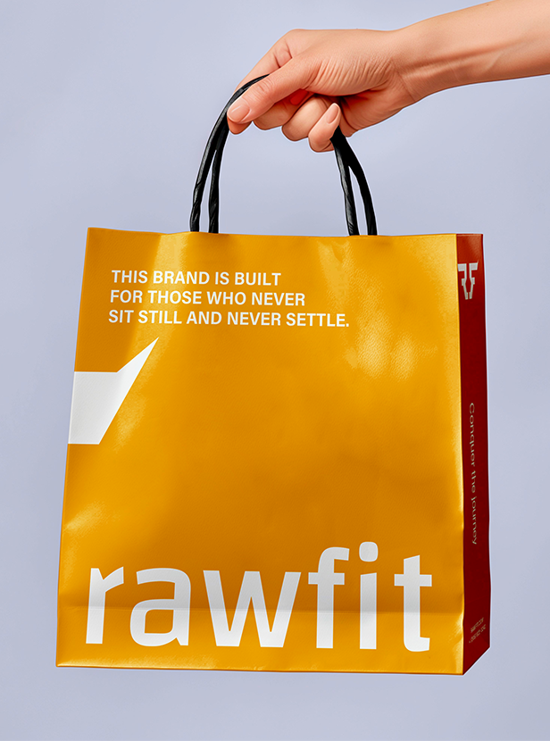
From the logo to the tone to the packaging, every element is made to inspire. This isn’t just merch. It’s fuel for your fire.

Logo Design
RawFit was never meant to blend in. From day one, the goal was clear: create a brand that looks as bold as it feels. The logo had to reflect that energy. No fluff. No compromise.
While many fitness brands chase overdesigned marks, we went in the opposite direction. RawFit's logo is strong, stripped-back, and built with purpose. The design leans into clean, geometric forms that speak to discipline, structure, and power. It's a mark that feels just as at home on a training tee as it does on a billboard.
Every angle is intentional. Every space earns its place. To balance the strength of the symbol, we paired it with a bold, modern typeface. Clean, sharp, and legible in motion. This lockup brings clarity and confidence to the brand, while staying versatile enough to scale across apparel, packaging, and digital.
The result is a logo that doesn’t just represent RawFit. It embodies it. Direct. Motivating. Built for the climb.




Photography
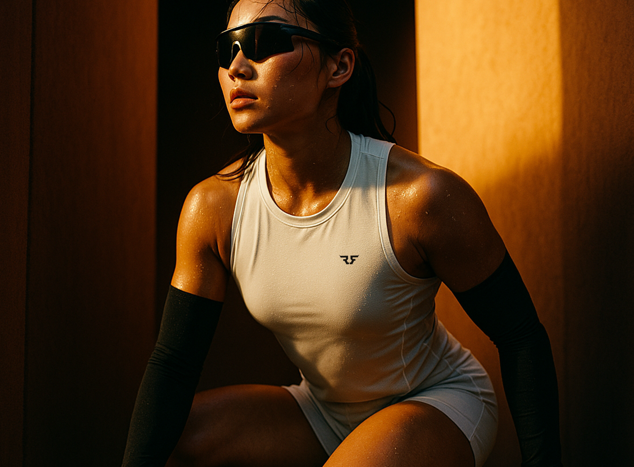
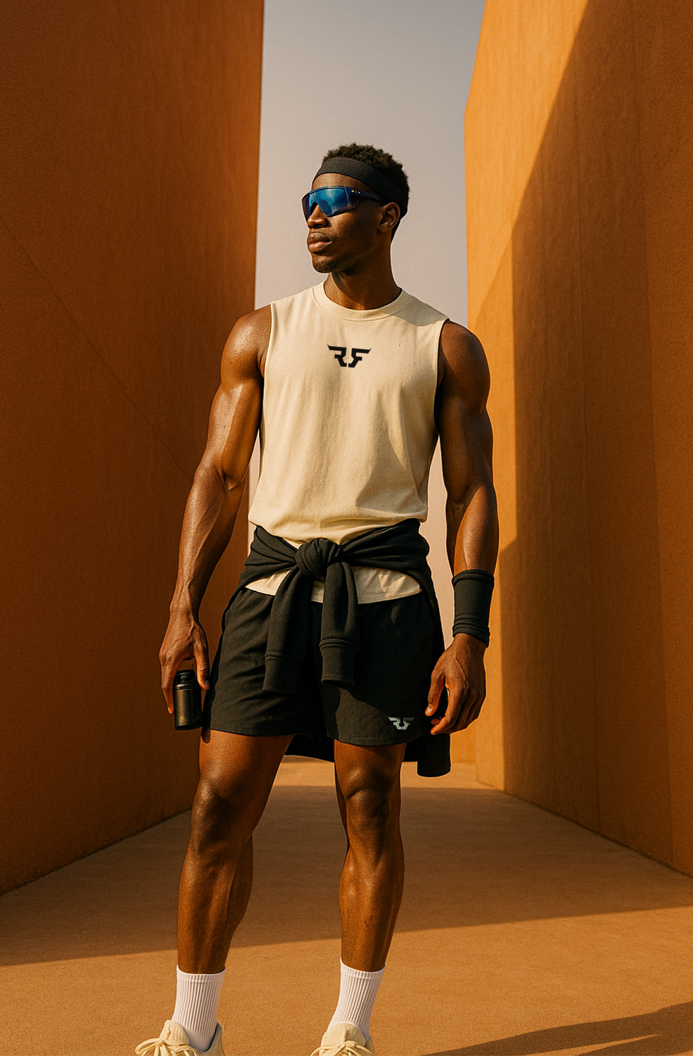
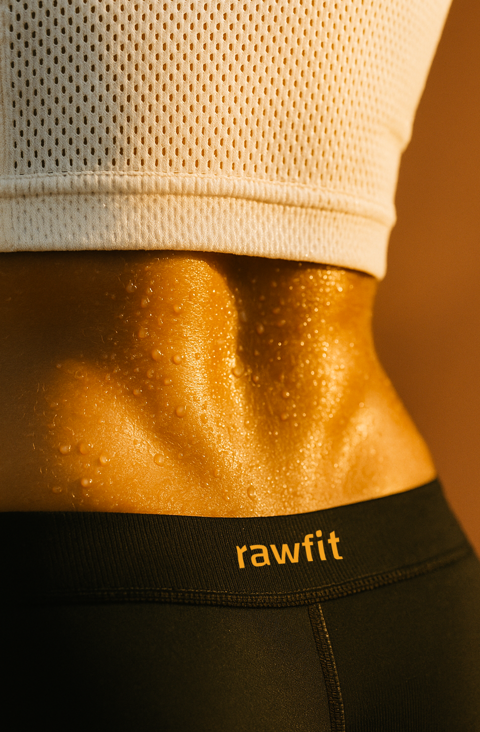
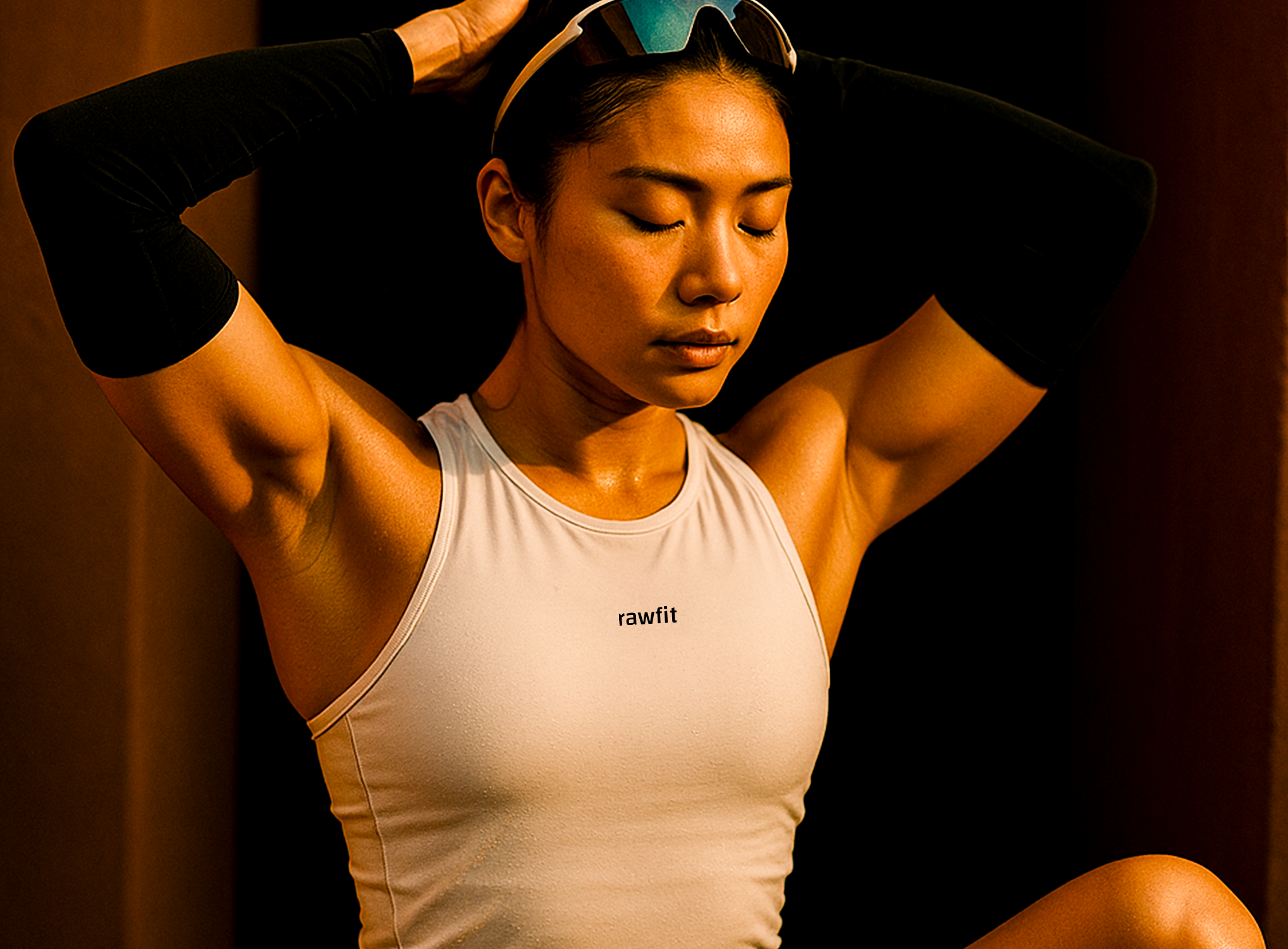
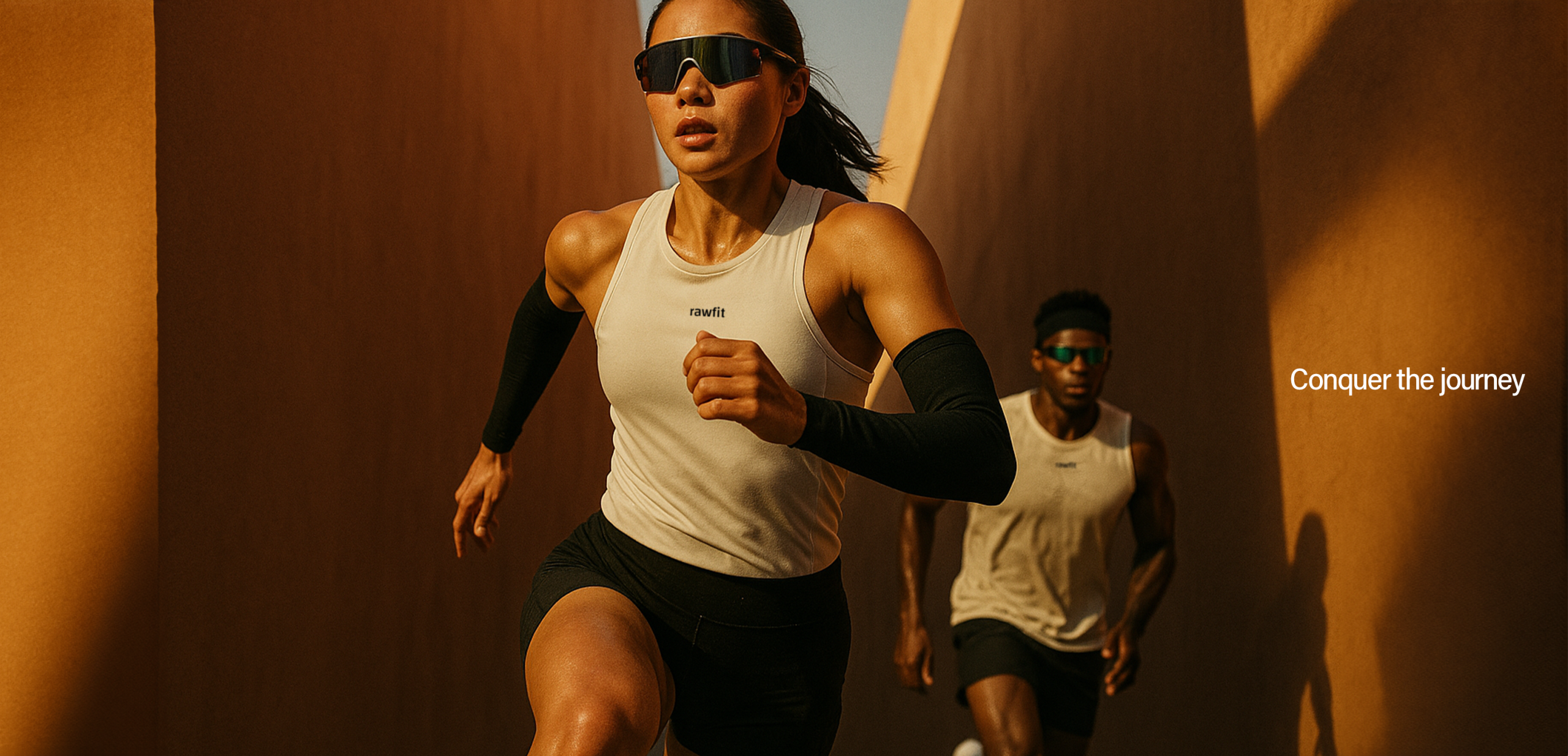
RawFit’s photography captures more than movement. It captures mindset. Every frame is designed to feel raw, focused, and alive, reflecting the emotional intensity of the athlete mid-push and mid-progress.
We leaned into natural light, deep shadows, and a warm, golden tone to bring out the grit and heat of the journey. The textures of sweat, skin, and motion aren’t polished or posed. They are intentional reminders that progress is earned, not staged.
The use of architectural backdrops adds dimension and discipline, echoing the structure and purpose behind the brand. Composition is tight and powerful, placing the athlete front and center, showing strength in form and vulnerability in focus.
This approach stands apart from the overproduced look of traditional fitness campaigns. It’s not about perfection. It’s about presence. The result is a photographic style that feels immersive, human, and honest. It’s designed to inspire action, not just admiration.
Every shot reflects RawFit’s core belief: progress is personal, and the journey is always worth it.
Color Theory
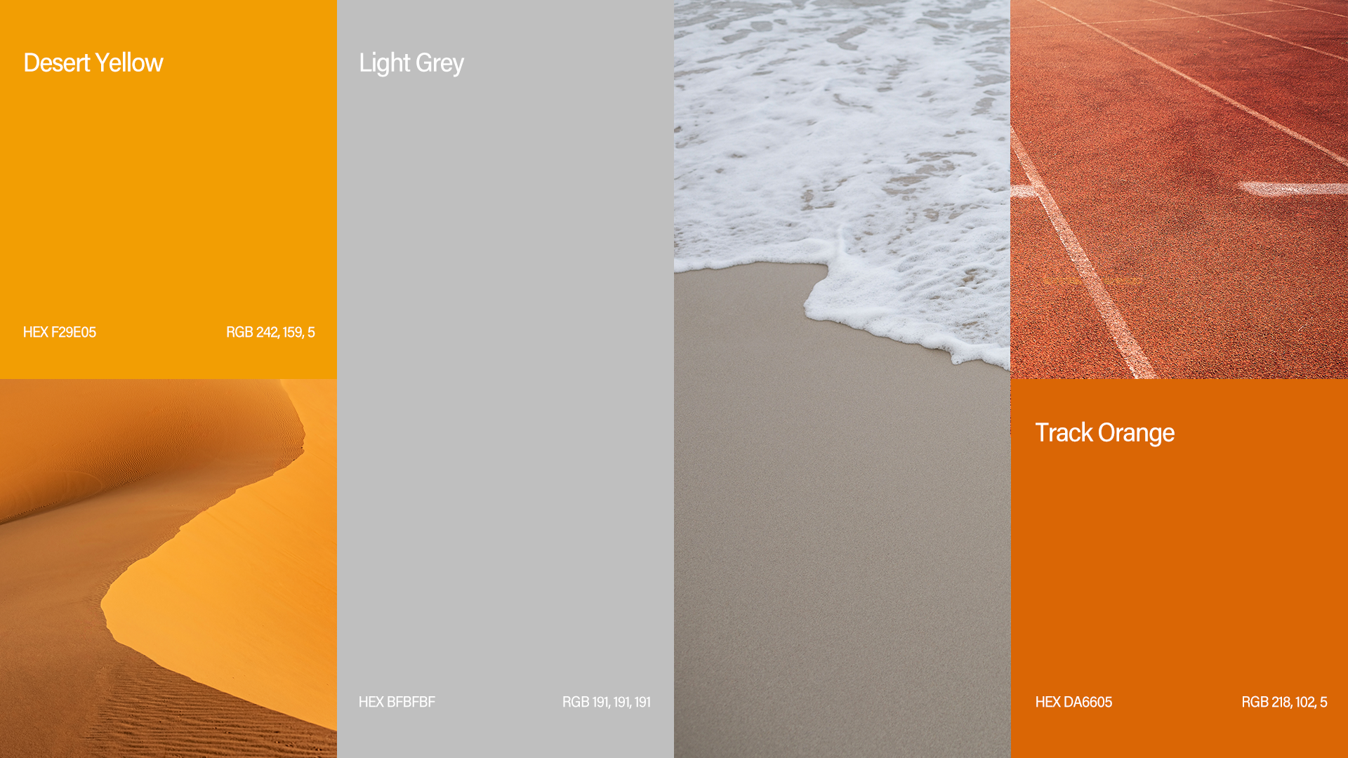
RawFit’s palette is built for energy, heat, and focus. Desert Yellow leads the charge. It’s vibrant, warm, and unapologetically bold. It reflects grit, sun-soaked hustle, and nonstop momentum.
Track Orange brings the same intensity you feel sprinting toward the finish. It's athletic, fiery, and impossible to ignore.
To balance the heat, we introduced Black and Light Grey. These neutrals add contrast, keep things sharp, and give the brand a clean, modern edge.
The result is a color system that speaks the RawFit language.
Loud. Focused. Ready to move.
Visual Identity
RawFit’s identity is grounded in clarity, motion, and strength. We chose Acumin Pro as the brand’s core typeface for its modern versatility and clean geometry. It’s strong without shouting, stylish without trying too hard, and perfectly suited for a brand built on focus and ambition.
To support the typography, we built a layout system that’s clean, purposeful, and always in motion. Structured grids and high-contrast spacing mirror the precision and discipline of training. Every element works hard, just like the people wearing the brand.
RawFit doesn’t follow the usual fitness playbook. It creates its own. Inspired by Miami’s heat and the energy of constant movement, we leaned into warm, charged tones like Desert Yellow and Track Orange. Balanced with black and grey, the palette brings impact without sacrificing adaptability.
From digital to physical, every piece of the identity is built to move with intent. It’s not just a look. It’s a mindset.

